Version 2023.1.0
The Obeo Studio is a unique technology to easily develop custom and state-of-the-art modeling tools to be deployed to the Cloud.
The Obeo Studio is built as an open-core product relying on the open source Eclipse Sirius project (EPL 2.0 licence) and more precisely on the Sirius Web component. Sirius Web is a framework from Obeo for building cloud graphical modeler for a dedicated DSL. The Obeo Studio is a Sirius Web build extended with Enterprise features, to deploy on public, private clouds or on premise and including support and upgrade guarantees.
This documentation details features coming from Sirius Web and the Obeo Studio. You can see if a feature comes with Sirius Web or the Obeo Studio thanks to the Before you Start section :
-
the icon highlights open source features from Sirius Web,
-
the icon highlights enterprise features from the Obeo Studio.
User Manual
1. Getting Started
1.1. Ask for an Obeo Studio account
|
Before you Start
Who can use this feature Anyone can ask for a free Obeo Studio account. Check out our Obeo Studio requirements section for supported browsers and platforms. Included in the Obeo Studio |
1.1.1. Sign up
You can sign up by filling our form at https://demo.obeostudio.com/signup. If you have any question do not hesitate to send an email to ocp.support@obeo.fr. To create an account, you will need to provide us with these information (all fields marked with a '*' are mandatory):
-
Username (*),
-
Password (*),
-
Confirm password (*),
-
First name (*),
-
Last name (*),
-
Organization (*),
-
Country (*),
-
Email (*),
-
Phone,
-
That you agree to the Terms of Use and Privacy Policy associated to the Obeo Studio service (*),
-
If you want to subscribe to the Obeo mailing list to be informed about products (latest versions, articles, documentation, …) and upcoming events.
1.2. Obeo Studio requirements
Obeo Studio is browser-based software, which means it can be run on all full desktop operating systems (MacOS, Windows, Linux, etc), as well as Chrome OS.
1.2.1. Supported browsers and operating systems
The minimum browser requirements is:
-
Chrome 106, 107, 108
-
Firefox 106, 107, 108
|
We have planned to support for a later version:
|
| Obeo Studio does not support Internet Explorer: Supported Browser |
The minimum operating system (OS) requirements are:
-
Windows 10 or later
-
Apple macOS 13.x (Ventura) and later
-
Any Linux OS that supports the browsers mentioned above
-
Any Chrome OS that supports the browsers mentioned above
| You can find out what browser and operating system version you’re using via What’s my Browser. |
| If you are encountering speed, upload, download, or various interface problem with Obeo Studio it could be caused by a plugin, add-on, or extension that you have installed in your browser. To see if this is the case you can try disabling all plugins, add-ons, or extensions within your browser. |
1.3. Get help from the Obeo Studio Support Team
|
Before you Start
Who can use this feature All the users have access to free email support Check out our Obeo Studio requirements section for supported browsers and platforms. Included in the Obeo Studio |
The Obeo Studio offers support for all our users! We currently provide email-based support which we’ve found to be most effective for a number of reasons.
It’s easy for our support team to triage conversations and get them to the right people quickly. This helps us get you the answers you need so you can get back to modeling. It’s also easy for users to attach files, videos, and screenshots that our support team might need for troubleshooting more complicated issues.
When you need us, we’re here to help.
Contact the Obeo Studio support by sending an email to: ocp.support@obeo.fr.
1.3.1. What are Obeo Studio support hours?
Our support team members are in Europe.
Support hours: Monday through Friday 9am - 5pm (CET / UTC +01).
2. Using the Obeo Studio
2.1. Authentication
2.1.1. Log in to your Obeo Studio account
|
Before you Start
Who can use this feature Users with Any account Users will need to have already signed up for an Obeo Studio account Included in the Obeo Studio |
There is one way to log in to your Obeo Studio account.
2.1.2. Default redirection to log in page
While you are not not logged in by default you are redirected to the log in page.
2.1.3. Log in with your Username and Password
-
Head to https://demo.obeostudio.com.
-
Enter your Username and Password in the fields provided.
-
Click Log in to complete the process and access your account.
2.1.4. Log out
|
Before you Start
Who can use this feature Users with Any account Users will need to have already logged in Included in the Obeo Studio |
To log out:
-
Go to the up right corner on any Obeo Studio pages,
-
Click on the avatar, you can select the
Log outmenu. When you are logged out then you will be automatically redirected to the Log in page.
2.1.5. Authentication FAQ
How do I get an account to the Obeo Studio?
Navigate to the sign up page, fill the form and send your request. After a successful signup you should be able to use your new account directly.
How do I retrieve my Username / Password if I forgot them?
Ask to the administrator of the Obeo Studio server to send you back your credentials.
How do I change my Username?
Ask to the administrator of the Obeo Studio server to change the Username for you.
How do I reset my Password?
Ask to the administrator of the Obeo Studio server to generate a new password for you.
How do I delete my account?
Ask to the administrator of the Obeo Studio server to delete your account.
2.2. Projects
2.2.1. Getting started with Projects
|
Before you Start
Who can use this feature Users with Any account Users with Edit and Read-only access can work with projects Included in Sirius Web |
2.2.2. Project Structure
You can use Projects to group Models. It is not possible to create subprojects in your projects. All the models are represented at the same level in a project.
2.2.3. Projects Browser
The Projects Browser lists all the projects accessible with your account. To get it, navigate to: https://demo.obeostudio.com/projects
2.2.4. Create a Project
To create a new project, you have three possibilities:
-
Create a new Blank Project with no initial content.
-
Create a project from an existing Project Template, which will be already initialized with some pre-defined content and representations.
-
Upload a project from an archive which was previously downloaded.
To create a Blank Project from your Projects Browser, click on corresponding card (titled + Blank Project) at the top of the page.
-
It opens the Create a new project page,
-
Enter the project name,
-
Set the Project Visibility,
-
Click on Create.
You will be redirected to the newly created project. It will be initially empty; see below how to use the project editor view to create your own models and representations.
To create a new project from a Project Template, simply click on the corresponding template card at the top of the page. The new project will be automatically created and opened. Depending on the template, an initial representation (e.g. a diagram) may also be automatically opened.
The newly create project will have the same name as the template, so it is a good practice to rename it to avoid confusion. Note that which project templates are available will depend on how the Obeo Studio server you use is configured. Only the first three templates are directly visible in the Projects Browser top bar. If more templates are available, you can click on the Show all templates card to open a dialog which displays all the available templates (possibly on multiples pages).
Finally, you can Upload a project from an archive which was previously exported by clicking the Upload Project card and selecting a local archive file.
Every project you create will then have its own Project Editor.
|
Projects can be either private (the default) or public. Public projects are visible (but not editable) to all connected users. Private projects are only accessible to specific users with whom you share it. See Share a Project and Project Teams for more details. |
2.2.5. Rename a Project
|
Before you Start
Who can use this feature Users with Any account Users with Management access to the project Included in Sirius Web |
You can update the Project name from the Projects Browser:
-
In the Project list, go over the Project to get the Rename button,
-
Click on the Rename button,
-
Update the name in the editable field,
-
Click on Rename.
Project names don’t need to be unique. Unique names do make it easier when it comes to finding the correct Project.
2.2.6. Delete a Project
|
Before you Start
Who can use this feature Users with Any account Users with Management access to the project Included in Sirius Web |
You can delete a Project from the Projects Browser:
-
In the Project list, go over the Project to get the Delete button,
-
Click on the Delete button.
|
When you delete a project, you will lose all the data. If the project is a Public or Private project shared with other users, it will be deleted for everyone. |
2.2.7. Share a Project
|
Before you Start
Who can use this feature Users with Any account Users with Edit access to the project Included in Sirius Web |
You can own projects individually, or you can share projects with other people.
You can restrict who has access to a project by choosing the project’s visibility. For more information, see Project Owner and Visibility.
For projects you own, you can give other users access so that they can collaborate on your project.
-
Open the Project Editor.
-
Click the Settings button in the right-corner.
-
Set the Visibility:
-
Select Public to give read-only access to everyone to your project.
-
Select Private to give more fined-grained access to selected members of a Project Teams.
-
2.2.8. Share a Diagram
|
Before you Start
Who can use this feature Users with Any account Users with Read-only access to the project Included in Sirius Web |
-
Open the Project Editor.
-
Select a diagram in the Project Explorer.
-
Click the Share button at the top of the diagram area.
-
Copy the link to your clipboard.
Anybody who has an account and at least read-level access to the project, anybody you share the link with can use it to go directly to this specific diagram.
2.2.9. Project Editor
In the body of the Project Editor you can see three panels. In the left panel you can choose between:
-
The Project Explorer with all the models in this Project (open by default),
-
The Validation View with all the models diagnostics.
To switch between the two, click on the corresponding icon in the left icon bar. You can also hide/collapse the currently opened view by clicking on its icon to make more room for the central representation area. Simply click again on the icon to reveal the view.
The main panel contains the Representation Editor. It can contain, among others, diagrams or forms.
The right panel work like the one on the left, but let you choose among three possible views:
-
the Details view which presents the properties of the current selected element (open by default).
-
the Representations view which lists all the existing representations associate to the current selected element.
-
the Related Elements views, which shows you the currently selected element in context: it shows which elements refer (point to) the selection (in the Incoming category), which elements the selection itself refers to (Outgoing), and where in the model hierarchy the selection is located (the Current category which shows the elements parents and children).
Some actions can be done using the Project Context Menu.
Project Explorer
The project explorer shows all the models and their content in this project as a tree, where items can be expanded or collapsed.
The root elements in the tree are the models which exist in this particular project. Inside the models you will find the semantic elements, instances of your business domain concept, with their children. Whenever there is a representation (e.g. a diagram) associated to a particular semantic element, it will also appear as a child of the semantic element.
Each tree item can be selected.
-
Selecting a semantic element will display its properties in the Details View (if it is opened). If the selected element is represented on a diagram that is currently opened, the graphical element (node or edge) where it appears on the diagram will also be selected, and the view will center on the selected element.
-
Selecting a representation will open it in a new tab (or focus on an existing tab where it was already open).
Project Explorer Context Menu
|
Before you Start
Who can use these features Users with Any account Users with Edit access to the project Included in Sirius Web |
Tree items have a context menu which actions depend on their type.
With models (root elements), the user can:
-
create a new root object inside the model,
-
rename the model,
-
download the model,
-
delete the model.
With Representations, the user can:
-
rename the representation,
-
delete the representation.
With semantic objets, the user can:
-
create a new child object,
-
create a new representation,
-
rename the object,
-
delete the object,
-
Open the context menu of the parent element.
-
Click on New object.
-
Select which type of object to create.
-
Click on Create.
The created element is selected in the project explorer.
-
Open the object context menu.
-
Click on Rename.
-
Change the object name.
-
Validate with "Return" key or click anywhere
-
Alternatively, Cancel with "Esc" key.
-
| Instead of using the context menu to rename an object, you can hit "F2" key or even, start typing the new name. |
-
Open the object context menu.
-
Click on Delete.
The object and its children - semantic element and representations - will be deleted.
| There is no confirmation dialog to delete an object. This operation is irreversible, once done there is no mean to get the object back. |
-
Open the model’s context menu.
-
Click on Delete.
-
Click on Delete to confirm the dialog.
The whole model and its content will be deleted.
| There is no confirmation dialog to delete a model. This operation is irreversible, once done there is no mean to get the model back. |
See the Download Model section.
-
Open the context menu of a semantic element.
-
Click on New representation.
-
Fill the name and choose the representation type. Only the representations which are compatible with the selected element are proposed.
-
Click on Create.
The representation will be created and open in the Representation Editor.
Validation View
The validation view shows diagnostics of the whole project. Diagnostics are sorted by kind (for example ERROR, WARNING or INFO) and can be either hidden or displayed thanks to an accordeon widget.
Details View
The details view shows the characteristics of the selected semantic object. It is made up Property sections for each characteristic of the semantic object.
Checkbox property Section
The value of the checkbox is sent to the server when the user changes the checkbox value.
List property Section
The list property section is a read only property that cannot send value to the server.
Radio property Section
The value of the radio button is sent to the server when the user selects another radio button.
Select property Section
The value of the select is sent to the server when the user changes the selected option.
Textfield property Section
The content of the textfield is sent to the server when the end user uses the "Enter" key, or when the focus is lost.
Textarea property Section
As this widget contains multiple lines, the "Enter" key will add a new line. The content of the textarea is sent to the server only when the focus is lost.
Rich text property Section
This widget behaves like the Textarea property section, but displays (and saves) formatted text using the Markdown syntax.
Each Property section is able to displays the first diagnostic that applies to the property.
|
A diagnostic displayed in the Details View should be present in the Validation View. |
Representations View
The representations view lists all the existing representations associated to the selected semantic object. You can open any such representation by simply clicking on it in this view. You can also delete a representation without opening it first by clicking on the "Delete" icon at the right of the representation name.
Project Context Menu
Create a new Model in a Project
|
Before you Start
Who can use this feature Users with Any account Users with Edit access to the project Included in Sirius Web |
-
Open the Project Editor.
-
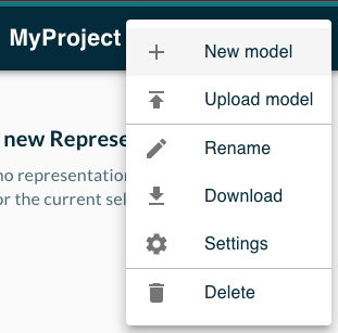
Open the context menu of the project
-
Select the New model action.
-
Fill the model Name.
-
Select the Model type.
-
Click the Create button.
The newly created model is listed in the Project Explorer.
Upload an existing Model in a Project
See the Upload a Model section.
Rename the Project
|
Before you Start
Who can use this feature Users with Any account Users with Management access to the project Included in Sirius Web |
-
Open the Project Editor.
-
Open the context menu of the project.
-
Select the Rename action.
-
Fill the textfield with the new project name
-
Click the Rename button.
Download the Project
See the Download Project section.
Delete the project
|
Before you Start
Who can use this feature Users with Any account Users with Management access to the project Included in Sirius Web |
-
From the Project Editor
-
Open the context menu of the project.
-
Select the Delete action.
-
Click the Delete button.
| This action is undoable, the project will be removed without any means to get it back. |
2.2.10. Project Settings
|
Before you Start
Who can use this feature Users with Any account Users with Edit access to the project Included in the Obeo Studio |
You can adjust various settings of a project from the Project Settings page, accessible using the gears icon in the top-right of the Project Editor:
-
The Overview tab gives some general information about the project.
-
From the Teams tab you can give fine-grained access to the project to specific groups of users.
-
From the Webhooks tab you can configure which webhooks are enabled for this project.
Project Owner and Visibility
The current project owner and visibility are available in the Overview tab of the project settings.
A project is always owned by a single user, initially the one who created the project. Regardless of the other settings, the project owner always has complete admin access to the project and its settings.
If you are the owner of a project or have admin rights on it, you can transfer the ownership to a different user. In the Overview tab of the project settings page:
-
enter the username (login) of the new owner in the text field.
-
click on the Change owner button.
The effect is immediate. Note that if the project is private and you do not have explicit access to it as part of a Team (see below), transfering ownership to someone else can lock you out of the project. Use with caution!
A project also has a visibility, which can be either public or private.
-
If a project is public, all users on the system will be able to view all of its content, but not make any modification (unless explicitly authorized).
-
If a project is private, by default only the project owner can view it.
To change the visibility of a project after its creation, assuming you have the rights to do it, simply select your choice in the project setting’s overview tab. The effect is immediate.
To give Read-only access to a private project or give collaborators Edit access to a (public or private) project, you can define Teams in the corresponding tab.
Project Teams
Teams let you invite collaborators to access your project. You can control how collaborators interact with your Team using Access level.
Adjust Team Access Level
As the owner of a project, you can update the access level of a team at any time:
-
Open the Project Settings page.
-
Click the View all teams link next to the Teams section.
-
Set the Access level for a team.
There are three to choose from:
-
Read-only: Viewers can only see all the models and representations of the project but can not make any change.
-
Edit: Contributors can see, create and edit all the models and representations of the project.
-
Admins: Administrators can see, create and edit all the models and representations of the project and manage the project owner and teams.
This setting will define what level of access each user or team has within a project. Note that a given user can be part of multiple teams; in that case, his access level is the highest one of all the teams he is part of.
Public Project |
Private Project |
||||||||
|---|---|---|---|---|---|---|---|---|---|
View |
Edit |
Manage |
Own |
View |
Edit |
Manage |
Own |
||
Everyone |
|
|
|||||||
Team member |
Viewer |
|
|
||||||
Contributor |
|
|
|
|
|||||
Administrator |
|
|
|
|
|
|
|||
Owner |
|
|
|
|
|
|
|
|
|
Create a Team
When you create a new team, the first thing to define, aside from its name, is its Access Level.
To create a new team:
-
Open the Project Settings page.
-
Click the View all teams link next to the Teams section.
-
Click the New team button.
-
Set the team name.
-
Set the access level.
-
Click on Create team.
|
Three teams are created by default:
|
Delete a Team
To delete a team:
-
Open the Project Settings page.
-
Click the View all teams link next to the Teams section.
-
Click the Delete button in the Team’s list.
Add a Team Member
-
Open the Project Settings page.
-
In the Add member section, set the Username of the collaborator you want to invite.
-
Select the Team of the collaborator.
-
Click on the Add button.
The collaborator is listed in the Teams section under the selected team.
Remove a Team Member
-
Open the Project Settings page.
-
In the Add member section, set the Username of the collaborator you want to remove.
-
Select the Team of the collaborator.
-
Click on the Remove button.
See a Team Member
-
Open the Project Settings page.
-
Navigate to the Teams section. It lists all the teams with their members. It shows also the access level associated to the team.
Webhooks
See the relative section in the Developer guide.
Project Images
The Project Images tab can be used to upload custom image files to the server. These images are stored on the backend and accessible via plain HTTP URLs.
All the custom images for the current project are displayed in a table with:
-
the image Label (which is only for information purposes);
-
the server-relative URL where the image can be obtained, will be of the form
/custom/<unique-id>. Two icons are visible at the right of the URL: the first copies the URL into the clipboard, the second can be used to preview the image. -
a Delete button which can be used to remove the image (after a confirmation). Deleting an image completely removes it from the server, and may break existing representations which use it.
The images can be used anywhere an URL-based image can be used:
-
in a Form using the Image widget type. In the image’s URL Expression, enter the server-relative image URL which will be of the form
/custom/<unique-id>. -
as the Shape of Node description defined in a View-based diagram definition when using an Image style. In this case, all the accessible custom images (which includes the current project images but may include more) are available in the "Shape" combo using their label.
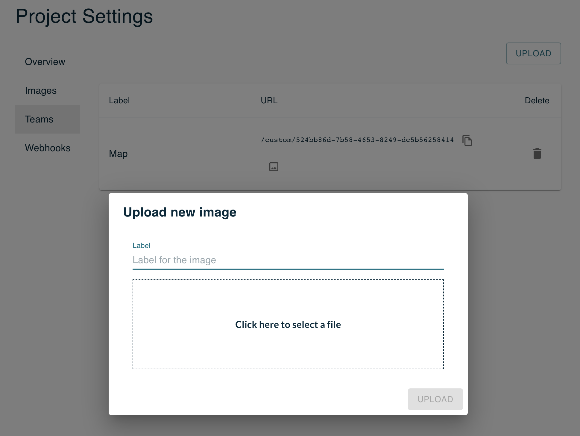
To add a new image to the project:
-
Click on the Upload button in the top-right corner of the Project Image tab.
-
A dialog will open where you can enter the label for the new image and open a file dialog to select the local file to upload. The label is optional and will default to the name of the image file (without the extension) if not set.
-
Once you have selected the image file, click on the Upload button to perform the upload.
To remove an image, simply select the corresponding Delete icon in the table and confirm the deletion.
2.3. Download / Upload
2.3.1. Getting started with Downloads
|
Before you Start
Who can use this feature Users with Any account Users with Edit and Read-only access to a project can export data Included in Sirius Web |
The Download feature allows you to export your data from the Obeo Studio to your computer.
Download a Project
You can export the contents of a project to your local disk in two different ways:
-
From the global Projects Browser page:
-
Click on the menu icon (three dots) on the line of the project to export.
-
In the context menu that opens, click on the Download button.
-
A ZIP archive named after the projet is automatically saved on your disk.
-
-
From the menu of the project itself when in the Project Edition page:
-
Open the project menu available in the header next to the project name.
-
In the context menu that opens, click on the Download button.
-
A ZIP archive named after the projet is automatically saved on your disk.
-
| The archive contains all the representations and models defined in your project serialized as JSON. |
Download a Model
To export an individual model to your local disk:
-
Open the Project Edition page for the project which contains the document.
-
In the Project Explorer, select the top-level element which represents the document to export, and open its menu by clicking on the button (three dots) at the right.
-
Click on the Download button, an XML file named after your document is saved on your disk.
| To store the model content, we use the EMF persistence framework and the default XMI provider. XMI (XML Metadata Interchange) is a standard for exchanging metadata information via Extensible Markup Language (XML). |
2.3.2. Getting started with Uploads
|
Before you Start
Who can use this feature Users with Any account Users with Edit access to a project can import data Included in Sirius Web |
The Upload feature allows you to import your data from your computer the Obeo Studio.
Upload a Project
To import a project into the Obeo Studio, you have to :
-
Go to the Projects Browser page.
-
Click the Upload Project card at the top.
-
Click on the Click here to select a file area.
-
Select a compatible archive with the file selector.
-
Click on the Upload project button.
-
The project page opens, you can see the models in the model explorer.
| A compatible archive is a zip file you retrieved from the Download a Project action in the Obeo Studio. |
Upload a Model
To import a model from your local disk to the Obeo Studio, you have to :
-
Go to the Project Editor.
-
Open the context menu of the project in the header.
-
Select the Upload model action.
-
Click on Click here to select a file
-
Choose a model from your local disk.
-
Click on the Upload button, a new model will be displayed as a root element, in the project explorer.
| To store the model content, we use the EMF persistence framework and the default XMI provider. XMI (XML Metadata Interchange) is a standard for exchanging metadata information via Extensible Markup Language (XML). |
2.3.3. Export FAQ
Is it possible to upload an EMF model I created classicaly with Eclipse?
Yes definitely, if the metamodel corresponding to the model instance is deployed on the server. You can use the Upload a Model capability to import your data into the Obeo Studio.
How do I download a project?
See the Download a Project section to learn how to proceed.
How do I download a model?
See the Download a Model section to learn how to proceed.
How do I upload a project?
See the Download a Project section to learn how to proceed.
How do I upload a model?
See the Download a Model section to learn how to proceed.
3. Administrating the Obeo Studio
3.1. Account Administration
3.1.1. Getting started with Accounts' Administration
|
Before you Start
Who can use this feature Users with Administrator access to the server can manage the users' accounts Included in the Obeo Studio |
As an administrator you can manage user accounts:
-
Navigate to the Log in page to connect to the Obeo Studio with your Administrator credentials
-
Then go to the Administration home page: https://demo.obeostudio.com/admin/accounts
3.1.2. Get all the existing accounts
On the accounts page you can see all the Normal and Administrator accounts listed by Usernames for the running Obeo Studio instance. The accounts are sorted by username and may span multiple pages (see the bottom of the page to access other pages).
For each account the page lists:
-
Username: the unique user name used to log in
-
Email: the email associated to the account
-
First Name and Last Name: the name of the user.
-
Created On, Modified On, Logged In: the dates when the account was first created, when it was last modified, and the date of the most recent login (which may be empty for users which have not yet logged in).
-
Enabled: whether or not the account is currently enabled.
3.1.3. Enable/Disable accounts
Each account can be enabled or disabled thanks to a checkbox. Newly created accounts (whether created by the user or by an admin) are enabled by default. When a user account is disabled, the corresponding user will not be able to login anymore but his account is still present and can be re-enabled by an admin at a later date.
Note that disabling a user account will only have an effect the next time the user tries to login, and will not immediatly invalidate his session if he is connected.
3.1.4. Create an account
To add a new user account:
-
Navigate to the Administration home page
-
Click on the New account button
-
Fill the Username, Email, Password, Confirm password fields
-
Click on the Submit button
-
Send the credentials you just created to the user via a secure channel
|
Account created using this view will be enabled by default. |
|
Users can also sign up and create a new account themselves by going to https://demo.obeostudio.com/signup. |
3.1.5. Remove an account
To delete an existing user account:
-
Navigate to the Administration home page
-
Click on a user in the users' list
-
Click on the Delete button
-
Confirm the deletion
3.1.6. Change the password
To change the password of an existing user account:
-
Navigate to the Administration home page
-
Click on a user in the users' list
-
You are redirected to the Reset Password page
-
Fill the Password and Confirm password field with the new values
-
Click Submit to apply
Studio Maker Guide
There are three ways that can be used to define modelers/studios in Obeo Studio:
-
Web Studio Definition: define your studio from your browser. It is targeted for relatively simple cases at the moment.
-
Eclipse Platform Studio Definition: reuse an existing Sirius Desktop based studio. The Sirius Desktop compatibility layer is there if you already have a modeler defined through a Sirius Desktop
odesignfile. -
Custom Code Studio Definition: extend your studio definition by using the Obeo Studio APIs. If you are a professional developer, you can use the Obeo Studio APIs directly, by creating your own
IRepresentationDescriptionin Java.
4. Web Studio Definition
|
Before you Start
Who can use this feature Users with Any account Users with Edit access to a project Included in Sirius Web This feature is currently optional and may not be enabled in all deployments of Obeo Studio.
|
Obeo Studio supports the definition of complete modeling studios directly through the browser, with no need to write code or restart/redeploy the server.
It is one of the three ways that can be used to define modelers/studios in Obeo Studio.
| This feature is considered experimental at the moment. We encourage users to try it out and give us feedback by reporting bugs and feature requests/ideas, but this should not be used in production. In particular, it is currently possible to lose data when evolving domain definitions: models created using a previous version of a domain definition may be partially or totally lost when reloaded if the domain definition is modified in an incompatible way. See below the list of current limitations for more details. |
4.1. Getting started with Studio Definition
A studio definition is made of:
-
one or more domain descriptions, which define the concepts which will be manipulated by the studio in an abstract way (independently of how these concepts will be represented visually).
-
one or more representation descriptions, which define the concrete way(s) the domains will be represented (typically using diagrams, but can also be forms) and what operations end-users can perform on them (the edition tools available to end-users to interact with the diagrams, and through them with the domain models).
For users familiar with Sirius Desktop, defining a domain corresponds to creating an EMF metamodel, and defining a representation description corresponds to creating a Sirius Desktop odesign file.
|
As a studio maker you create your studio definition entirely through the web browser, using the same mechanisms as for creating and editing other kinds of models. Indeed, both the domain and representation descriptions mentioned above are models.
Once your studio has been defined, it can be used by other users, who can:
-
create concrete instances of the concepts described in the new domains;
-
visualize and manipulate these instances through the representations defined in the studio.
4.1.1. Create a new Studio
To create a new studio, create a new project which will contain both your domain and the corresponding representation descriptions. See the sections below for more details on how to configure your domain and representation descriptions.
| It is not supported to create instances of a given domain inside the same project which contains that domain’s definition. |
When authoring a studio, it is recommended to test early and often if it behaves like you expect on an example.
|
To avoid issues it is recommended to follow these strict rules:
|
Studio Definition Limitations
There are currently some limitations to be aware of:
-
Whenever you change something in the definition of a domain, you must close any project which contain instances of that domain, and wait a few seconds before re-opening it. Just reloading the browser’s page will not be enough for the instance project to pick up the new definition of your domain.
-
The model where you define your domain should contain nothing else, and in particular no instance of other dynamic domains.
-
There is currently no automatic migration of the data in domain instances. If you have created instances of a v1 of some domain, and then change the domain definition into a new version v2 which for example renames some elements, the data stored as instances of v1 may be partially or totally lost when re-opening the project and loading the model as an instance of v2.
4.1.2. Deploy a studio for end-users
To actually use a studio, you or your users need to create a separate project, which will contain the concrete instances and representations (diagrams, forms).
4.2. Define your custom Domain
To create your domain:
-
Open your studio definition project
-
In the project’s context menu (in the header), select New Model
-
In the dialog box that opens, select the Domain model type and give a name to your model.
-
In the project explorer, click on the related to the newly created Domain element.
The Domain is the root element which identifies your domain. Its only attribute is a name, which should be globally unique on a particular Obeo Studio server, and not contain any space or special character (technically, the name should be a valid Java identifier).
Inside a domain you can create Entities which represent the concepts in your domain and are similar to classes in Java, UML or Ecore. Inside an Entity you can create Attributes that describe their characteristics, and Relations from that entity to another one (or itself).
To configure your domain you can use the project explorer and the details view and/or the graphical diagram that can be created on the Domain itself. The diagram looks and behaves like a classical "class diagram" in e.g. UML or Ecore Tools.
-
An Entity has:
-
a name, which should be unique inside a given domain, and follow that same rules as for domains (i.e. no spaces of special characters),
-
zero of more super types, which can be used to inherit the attributes and relations from other entities,
-
an entity can be abstract, meaning no concrete instances can be created from it. Such entities are only useful to be shared as super types for other (concrete) entities.
-
-
An Attribute is defined by:
-
a name, which should should be unique among all the attributes and relations inside a given entity, including the inherited ones.
-
a type, which currently can only be one of:
STRING(the default),BOOLEANandNUMBER(which corresponds to integers). -
whether it is optional (or mandatory if the flag is unset) and many-valued (or single-valued if the flag is unset).
-
-
A Relation is very similar to an attribute and is defined by:
-
a name, which should should be unique among all the attributes and relations inside a given entity, including the inherited ones,
-
a target type, which points to an entity inside the same domain,
-
whether it is optional (or mandatory if the flag is unset) and many-valued (or single-valued if the flag is unset),
-
whether is is a containment relation or not.
-
4.3. Define your custom Representations
Representation descriptions are defined inside a View.
To create one:
-
open your studio definition project,
-
in the project’s context menu (in the header), select New Model,
-
in the dialog box that opens, select the View model type and give a name to your view.
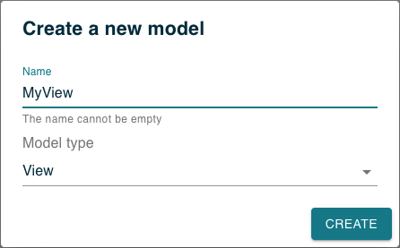
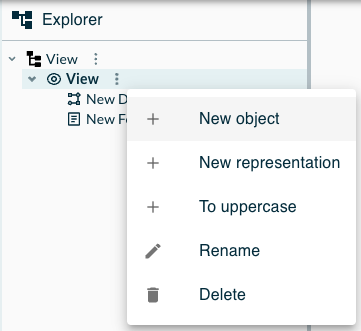
A View is a simple container for one or more representation descriptions; it has no attributes itself. If you used the steps above, your View should already contain a Diagram description, provided as a default representation description. It is also possible to create a Form description. Indeed, if you want to create new representation descriptions inside a View, just create ones by:
-
in the View's context menu (in the header), select New Object,
-
in the dialog box that opens, select Diagram Description or Form Description.
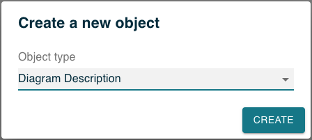
At the moment, diagrams and forms are the only types of representations that can be defined inside a view, but support for other types of representations which are supported by Obeo Studio when using odesign files and/or Java APIs will be added in future versions.
Several view elements can be parameterized with expressions. Those expressions can be identified in the details view thanks to a yellow background in their textfield. Inside of those textfield, you have access to some content assist
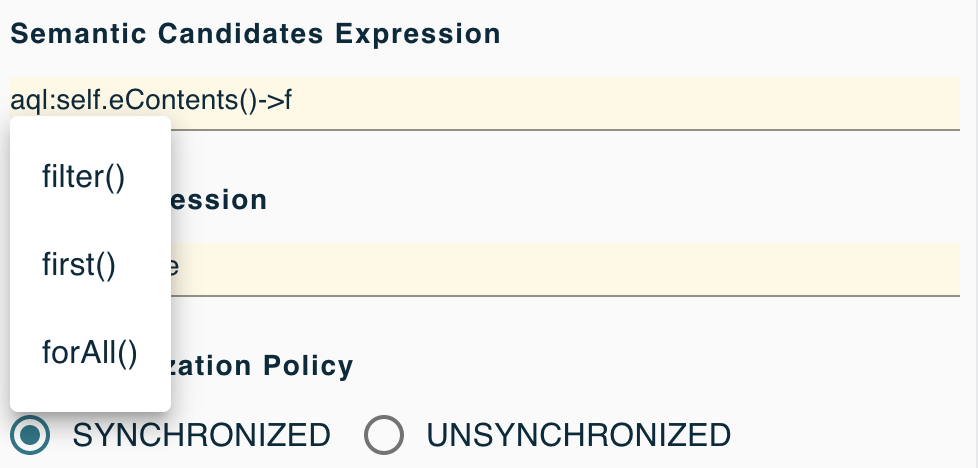
| Even for diagrams, not all features supported by Obeo Studio can be used in web-based definitions at the moment. |
4.3.1. Diagram description
A Diagram Description is the root element for the definition of a diagram. It has the following attributes:
-
Name: the name of the diagram description.
-
Domain Type: the type of semantic elements on which this kind of diagram can be created. This can be either the simple name of an entity defined in a domain (e.g.
Person) or an entity name qualified by the domain name (e.g.Family::Person). -
Precondition Expression: an expression which can be used to refine on which types the diagram can be created. By default all instances of the domain type or any sub-type will match. If you provide a precondition expression, the concrete type is available in a variable
class, and you can use it to e.g. exclude some sub-types. -
Title Expression: an expression (typically using AQL) that will be evaluated when a new diagram instance is created to compute the title of that diagram. The expression is evaluated in the context of the semantic element on which the diagram is created.
-
Auto-Layout: a boolean which indicates if the layout should be automatically computed by Obeo Studio or controlled manually the the end-user (the default).
A diagram is made of nodes (which can optionally contain other nodes) and edges which connect them.
Inside a diagram description you define the types of nodes and edges that you want. On a particular diagram which represents a specific model, each node and edge type will produce zero or more actual node and edges depending on the presence of actual domain objects which match the node and edge descriptions.
A diagram can also contain a Drop Tool, which will be invoked when a semantic element is dragged from the explorer onto the diagram’s background. You can define the behavior of the drop tool as you want, but a typical use case is to use the Create View operation (described below) to create a new node representing the semantic element.
Nodes
A Node Description has the following attributes:
-
Name: the name of the node description. Only visible to studio makers to distinguish different types of nodes.
-
Domain Type: the type of semantic elements represented by this kind of node. Follows the same rules as for the diagram’s Domain Type attribute.
-
Semantic Candidates Expression: an expression which will be evaluated in the parent context and should return the semantic elements (from anywhere in the model) which should be represented by this kind of node. Only elements which match the declared Domain Type are retained. A concrete graphical node of this type will appear in the diagram for each of the elements returned.
-
Label Expression: an expression which will be evaluated in the context of a particular node’s semantic element to compute the label to display for the node.
-
Synchronization Policy: determines how the set of graphical nodes appearing on the diagram are synchronized with the state of the underlying semantic model.
-
SYNCHRONIZED: this is the default. In this mode, all semantic elements returned by the semantic candidates expression (provided they are instances of the domain type) will be represented by a graphical node.
-
UNSYNCHRONIZED: in this mode, only the semantic elements for which a view (node instance) has been explicitly created (by a tool) will get represented.
-
Using synchronized nodes means that the set of nodes the end-user sees on a diagram is always in synch with the current state of the model. If a semantic element which was represented by a node is removed from the model, the node will disappear. If a new semantic element (which matches the node’s definition) appears inside the model, a new node will automatically appear on the diagram.
Using unsynchronized nodes means that the diagram will only show such nodes for which a view (graphical node) has been explicitly created by a tool. If a semantic element which was represented by a node is removed from the model, the node will disappear as un synchronized mode. If a new semantic element (which matches the node’s definition) appears inside the model, a new node will not automatically appear on refresh. Invoking a tool (which will create the view explicitly) will be needed for a node representing the new element to appear.
Use the synchronized mode if it is important that what the end-user sees always reflects the complete state of the underlying model, i.e. everything that exists inside the semantic model is always visible. Use the unsynchronized mode if you want to let the end-user decide which parts of the semantic model are represented graphically.
Nodes can have sub-nodes which will appear inside their parent, recursively. Nodes can also have border nodes, which will appear on the border of their parent.
Using the Reused Child Node Descriptions and Reused Border Node Descriptions, you can also reference existing node description from elsewhere in you diagram description. This can be used to share common node definitions in multiple place in your diagram definition. It is also possible (and useful) for a node to reuse itself (or one of its ansectors) to support recursive containment definitions of unbounded depth. Be careful when using this feature as it can cause infinite loops when rendering a diagram if misconfigured. Note that you can only reuse node definitions from inside the same Diagram description.
A node description must also have a Layout Strategy, which will determine how it represents its children nodes (if any). This is configured using a sub-element of the Node Description which can be either: * FreeFormLayoutStrategyDescription: this is the default. Child nodes will be placed inside the node’s content area, and (if in manual layout mode) the user can move and resize them freely. * ListLayoutStrategyDescription: in this mode the sub-nodes will be organized in a vertical list/stack and can not be moved or resized. This is useful when combined with the Icon-Label node style for these children.
Node Styles
Inside a Node Description you must create a Node Style element, which controls the visual aspects of the node. A node must have a default node style.
There are three possible kinds of node styles:
-
Rectangular node style: this is the default and corresponds to a plain rectangle filled with a uniform background color. If the With header flag is set, the node’s label will be separated from its content with a horizontal line.
-
Image node style: used to display custom images. You can select among the available images from a combo box (with a preview below). Each Obeo Studio server can have global images available, but users can also upload their own custom images in their own projects.
-
Icon-Label node: this is designed to be used for children of node using the List Layout strategy. These only render an (optional) icon and label.
Most of the Node Style attributes are self-explanatory and control the main color and border color of the node, the style of the label, etc.
The Size Computation Expression can be used to determine the default size of a node. It should return an integer which will be used as the default width and height of the node, in pixels. Note that this default size is only taken into account if no other constraint apply, like an explicit size set by the user or a minimum size required to contain all the children of a container.
Beside the main Node Style, a node can also contain one or more Conditional Node Styles.
They have the same attributes as a node style, with an additional Condition expression.
The effective style used for a particular node which has conditional styles will be the first one (in the order of definition) for which the condition, evaluated in the context of the semantic element, returns true.
If none of the conditional style has a matching condition, then the main/default (non-conditional) style is used.
Node Tools
Inside a node description you can also create tools to specify the interactive behavior of the node:
-
Node Tool: how to create a new instance of the node.
-
Label Edit Tool: what happens when the user edits its label. If specified, the Initial Direct Edit Label Expression will be evaluated when the end-user triggers a direct edit operation. Its result will be used to provide the initial text to edit if it should be different from the label’s value. This is useful the a label presents aggregate data but the end-user can only edit parts of it.
-
Delete Tools: what happens when the user deletes a node.
Inside the body of the tool definition you can use any of the operations described below to specify the behavior of the tool.
Note that Node Tools, which are used to create new instances, appear in the model explorer as children of the node descriptions, but in the corresponding diagram they will be available in the contextual palette of the container elements on which such a node can be created.
For each of these, if you do not specify a corresponding custom tool, Obeo Studio will provide a default behavior based on the entity displayed by the node (this may not work for all entities).
Edges
There are two possible kinds of edges:
-
domain-based edges are edges which represent a domain object themselves;
-
relation-based edges are edges which represent a relation (reference) between two domain objects.
Both are configured using the same Edge Description element, whose behavior depends on the Is Domain Based Edge flag.
An Edge Description has the following attributes:
-
Name: the name of the edge description. Only visible to studio makers to distinguish different types of nodes.
-
Label Expression: an expression which will be evaluated in the context of a particular element’s semantic element to compute the main label to display for the edge. The main label is displayed on the middle of the edge. It is also possible to specify the text for labels to display at the beginning of the label (on the source element side) using Begin Label Expression or at the end of the label (on the target element side) using End Label Expression.

-
Domain Type: the type of semantic elements represented by this kind of edge.
-
For domain-based edges, this is the type of the actual domain object represented by the edge.
-
For relation-based edge this is the type of the domain object which is the source of the relation.
-
-
Semantic Candidates Expression: an expression which will be evaluated in the parent context.
-
For domain-based edges, this should return the semantic elements (from anywhere in the model) which should be represented by this kind of edge. Only elements which match the declared Domain Type are retained.
-
For relation-based edges, this should return the semantic elements (from anywhere in the model) from which the relation to represent starts (i.e. the source of the relation). Only elements which match the declared Domain Type are retained.
-
-
Synchronization Policy: determines how the set of graphical edges appearing on the diagram are synchronized with the state of the underlying semantic model.
-
SYNCHRONIZED: this is the default. In this mode, all semantic elements or relations matching the edge’s definition will be represented by a graphical edges on the diagram.
-
UNSYNCHRONIZED: in this mode, only the semantic elements or relations for which a view (edge instance) has been explicitly created (by a tool) will get represented.
-
-
Source Node Descriptions and Source Nodes Expression: these are only used for domain-based edges, to identify the source element of the edge.
-
Target Node Descriptions and Target Nodes Expression: these are used in both cases, to identify the target element of the edge.
The effect of the synchronization policy on edges is equivalent to one for the node. See above for a detailed description.
Note that it is possible (and often useful) to create a synchronized edge between unsynchronized nodes. In this case, as soon as the source and target nodes of such an edge are represented on the diagram, the edge will automatically be created.
As an example, on a diagram which represents software modules as (unsynchronized) nodes, dependencies could be represented by synchronized edges. This way, as soon as two modules which have a dependency become visible on the diagram, the edge representing this dependency will appear.
Edge Styles
Inside an Edge Description you must create an Edge Style element, which controls the visual aspects of the node, including the style of the label and the optional decorators to display on each end of the edge.
Beside the main Edge Style, a node can also contain one or more Conditional Edge Styles.
They have the same attributes as an edge style, with an additional Condition expression.
The effective style used for a particular edge which has conditional styles will be the first one (in the order of definition) for which the condition, evaluated in the context of the semantic element, returns true.
If none of the conditional style has a matching condition, then the main/default (non-conditional) style is used.
Edge Tools
Inside a description you can also create tools to specify the interactive behavior of the edge:
-
Edge Tool: how to create a new instance of the edge;
-
Label Edit Tool: what happens when the user edits its label;
-
Delete Tools: what happens when the user deletes an edge.
-
Edge Reconnection Tool: you can specify either a Source Edge End Reconnection Tool or Target Edge End Reconnection Tool (or both) to allow end-users to reconnect the source and/or target of an edge to a different node. If such a tool is defined, it will be invoked when the user performs the corresponding reconnection action. Inside the body of the tool, you have access to the following variables to decide how to interpret the request:
-
edgeSemanticElement: the semantic element associated to the edge being reconnected itself. -
semanticReconnectionSource: the semantic element associated to the current source of the edge (before the reconnection). For relation-based edge this will be the same asedgeSemanticElement. -
semanticReconnectionTarget: the semantic element associated to the current target of the edge (before the reconnection). -
semanticOtherEnd: the semantic element of the node to which the edge is being reconnected.For a Source Edge End Reconnection Tool,
semanticOtherEndwill correspond to the intended new source end (as this is the end being reconnected). For a Target Edge End Reconnection Tool,semanticOtherEndwill correspond to the intended new target end.
-
Inside the body of the tool definition you can use any of the operations described below to program the behavior of the tool.
For each of these except edge reconnection, if you do not specify a corresponding custom tool, Obeo Studio will provide a default behavior based on the entity displayed by the edge (this may not work for all entities).
4.3.2. Form description
A Form Description is the root element for the definition of a form. It has the following attributes:
-
Name: the name of the form description.
-
Domain Type: the type of semantic elements on which this kind of form can be created. This can be either the simple name of an entity defined in a domain (e.g.
Person) or an entity name qualified by the domain name (e.g.family::Person). -
Precondition Expression: an expression (typically using AQL) which can be used to refine on which types the form can be created. The expression should return a boolean. By default all instances of the domain type or any sub-type will match. If you provide a precondition expression, the concrete type is available in a variable
class, and you can use it to e.g. exclude some sub-types. -
Title Expression: an expression (using AQL or a character string) that will be evaluated when a new form instance is created to compute the title of that form. The expression is evaluated in the context of the semantic element on which the form is created.
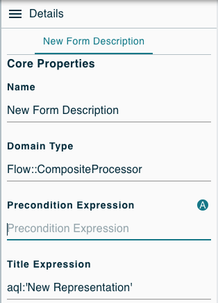
A form is made of Groups, which themselve contain Widgets Descriptions (the Flexbox Container Description can contain other Widgets Descriptions).
Inside a form you can add as many Group description as needed, but you need at least one to display widgets as they are contained inside a Group.
A group has the following attributes:
-
Name: the name of the group description.
-
Label Expression: an expression (using AQL or a character string) that will be evaluated when a new group instance is created to compute the title of that group. The expression is evaluated in the context of the semantic element on which the group is created.
-
Display Mode: controls how the widgets contained inside the group are presented. In LIST mode (the default), all the widgets inside the group are displayed vertically. In TOGGLEABLE_AREA mode, the group will display a group of toggle buttons, one for each widget, that can be used to hide/reveal each individual widget.
-
Semantic Candidates Expression: an expression which will be evaluated in the parent context and should return the semantic elements (from anywhere in the model) which should be represented by this kind of group. If the expression returns multiple elements, one group will be instanciated for each. The default is
aql:self, which means a single instance of the group is created on the same semantic element as the enclosing form.
Inside a group description you define both the toolbar actions and Widgets Descriptions that you want.
The Widgets Descriptions are described below. If you want to create new widget on a Form Description, just create one by:
-
in the Form Description's context menu (in the header), select New Object,
-
in the dialog box that opens, select any widget available in the drop-down list.
Inside a form description you can also define the Toolbar Actions Descriptions that you want. The Toolbar Actions Descriptions are described below. If you want to create new toolbar action on a Form Description, just create one by:
-
in the Form Description's context menu (in the header), select New Object,
-
in the dialog box that opens, select the toolbar action available in the drop-down list.
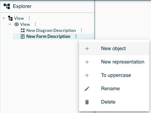

To simplify and speed up the process of building a for, a visual Form Description Editor is also available.
Bar Chart
A BarChart Description represents a bar chart inside the form. It has the following attributes:
-
Name: the name of the widget description.
-
Label Expression: an expression (using AQL or a character string) that will be evaluated to compute the label (as a character string) of that bar chart. The label will be located above the bar chart.
-
Keys Expression: an expression (typically using AQL) that will be evaluated to compute the keys of that bar chart (displayed on the X-axis). This expression must return a collection of character string.
-
Values Expression: an expression (typically using AQL) that will be evaluated to compute the value (displayed on the Y-axis) to associate to each key of that bar chart. The first value will be associated to the first key, the second value to the second key, and so on… This expression must return a collection of floating point numbers.
-
Y Axis Label Expression: an expression (using AQL or as a character string) that will be evaluated to compute the label (as a character string) of the Y-axis of that bar chart. The label will be located on the top of the Y-axis of the bar chart.
-
Width: if specified, determines the (fixed) width the bar chart in pixels. The default is 500px if no explicit value is set.
-
Height: if specified, determines the (fixed) height the bar chart in pixels. The default is 250px if no explicit value is set.
Button
A Button Description represents a button inside the form. It has the following attributes:
-
Name: the name of the widget description.
-
Label Expression: an expression (using AQL or a character string) that will be evaluated to compute the label (as a character string) of that button. The label will be located above the button.
-
Button Label Expression (optional): an expression (typically using AQL) that will be evaluated to compute the button label (as a character string) of that button. The button label will be located inside the button.
-
Image Expression (optional): an expression (typically using AQL) that will be evaluated to compute the button image from a path (as a character string). The button image will be located inside the button.
Checkbox
A Checkbox Description represents a checkbox inside the form. It has the following attributes:
-
Name: the name of the widget description.
-
Label Expression: an expression (using AQL or a character string) that will be evaluated to compute the label (as a character string) of that checkbox. The label will be located above the checkbox.
-
Value Expression: an expression (typically using AQL) that will be evaluated to compute the value (as a boolean) of that checkbox.
Flexbox Container
A FlexboxContainer Description represents an horizontal or vertical container inside the form. The container can contain other widgets. If you want to create new widgets descriptions inside a FlexboxContainer Description, just create ones by:
-
in the FlexboxContainer Description's context menu (in the header), select New Object,
-
in the dialog box that opens, select any widget description available in the drop-down list.
The FlexboxContainer Description has the following attributes:
-
Name: the name of the widget description.
-
Label Expression: an expression (using AQL or a character string) that will be evaluated to compute the label (as a character string) of that flexbox container. The label will be located above the flexbox container.
-
Flex Direction: a value, among the following ones:
-
row: all contained widgets will be distributed on the X-axis.
-
row-reverse: all contained widgets will be conversely distributed on the X-axis.
-
column: all contained widgets will be distributed on the Y-axis.
-
column-reverse: all contained widgets will be conversely distributed on the Y-axis.
-
Image
An Image Description_ represents an image inside the form. It has the following attributes:
-
Name: the name of the widget description.
-
Label Expression: an expression (using AQL or a character string) that will be evaluated to compute the label (as a character string) displayed on the top of the image.
-
URL Expression: an expression (using AQL, server related image path, or absolute URL) that will be evaluated to retrieve the URL of the image.
-
Max Width Expression: an expression (using AQL or a CSS length) that will be evaluated to compute the maximum width of the image. If no unit is specified, the length is assumed to be in pixels.
Label
A Label Description represents a non editable text inside the form. Even though this widget represents a Label, it displays its own label (like other widgets) on the top of the main text value. It has the following attributes:
-
Name: the name of the widget description.
-
Label Expression: an expression (using AQL or a character string) that will be evaluated to compute the label (as a character string) displayed on the top of the text.
-
Value Expression: an expression (typically using AQL) that will be evaluated to retrieve the value (as a character string) of that label.
Link
A Link Description_ represents an hyperlink inside the form. It has the following attributes:
-
Name: the name of the widget description.
-
Label Expression: an expression (using AQL or a character string) that will be evaluated to compute the label (as a character string) displayed on the top of the link.
-
Value Expression: an expression (typically using AQL) that will be evaluated to retrieve the value (the hyperlink as a character string) of that link.
-
Display Expression: an expression (typically using AQL) that will be evaluated to compute the text (as a character string) displayed for the link
List
A List Description represents a list of model elements inside the form. It has the following attributes:
-
Name: the name of the widget description.
-
Label Expression: an expression (using AQL or a character string) that will be evaluated to compute the label (as a character string) displayed on the top of the list.
-
Value Expression: an expression (typically using AQL) that will be evaluated to compute the items (as a collection of objects) of that list.
-
Display Expression: an expression (typically using AQL) that will be evaluated to compute the displayed value (as a character string) of a given item. The item is available through the candidate variable. For example: aql:candidate.name
-
is Deletable Expression: an expression (typically using AQL) that will be evaluated to compute the delete button status (as a boolean) for a specific item. The current item element, for which the button activation is computed, is available with the candidate variable.
Pie Chart
A PieChart Description represents a pie chart inside the form. It has the following attributes:
-
Name: the name of the widget description.
-
Label Expression: an expression (using AQL or a character string) that will be evaluated to compute the label (as a character string) of that pie chart. The label will be located above the pie chart.
-
Keys Expression: an expression (typically using AQL) that will be evaluated to compute the slices of that pie chart. This expression must return a collection of character string.
-
Values Expression: an expression (typically using AQL) that will be evaluated to compute the value to associate to each key (i.e. slice) of that pie chart. The first value will be associated to the first key, the second value to the second key, and so on… This expression must return a collection of floating point numbers.
Radio
A Radio Description represents a set of radio buttons inside the form. It has the following attributes:
-
Name: the name of the widget description.
-
Label Expression: an expression (using AQL or a character string) that will be evaluated to compute the label (as a character string) of that radio widget. The label will be located above the radio.
-
Value Expression: an expression (typically using AQL) that will be evaluated to compute the selected radio button of that radio widget.
-
Candidates Expression: an expression (typically using AQL) that will be evaluated to compute the list of candidates (a.k.a. the radio buttons) of that radio widget. This expression must return a collection of objects.
-
Candidate Label Expression: an expression (typically using AQL) that will be evaluated to compute the label (as a character string) of each radio button of that radio widget. The object behind the current radio button will be accessible using the variable named
candidate.
Rich Text
A Rich Text Description represents a rich text editor inside the form. It has the following attributes:
-
Name: the name of the widget description.
-
Label Expression: an expression (using AQL or a character string) that will be evaluated to compute the label (as a character string) of that rich text. The label will be located above the rich text.
-
Value Expression: an expression (typically using AQL) that will be evaluated to compute the value (as a character string) of that rich text in Markdown.
It works like the Textarea widget but expects the text returned by the value expression to be valid Markdown. It will display this text
Markdown features supported are:
-
bold, italic, strike-through and fixed-width (code) text styles;
-
ordered and unordered lists (including sub-lists);
-
headers
These styles can be applied by typing the Markdown syntax directly or by selecting some text and using the toolbar buttons.
Multi-Select
A MultiSelect Description represents a drop-down list inside the form. Users can choose multiple values inside the list. It has the following attributes:
-
Name: the name of the widget description.
-
Label Expression: an expression (using AQL or a character string) that will be evaluated to compute the label (as a character string) of that drop-down list. The label will be located above the drop-down list.
-
Candidates Expression: an expression (typically using AQL) that will be evaluated to compute the list of candidates (a.k.a. the drop-down items) of that drop-down list. This expression must return a collection of objects.
-
Candidate Label Expression: an expression (typically using AQL) that will be evaluated to compute the label (as a character string) of each drop-down item of that drop-down list. The object behind the current drop-down item will be accessible using the variable named
candidate. -
Value Expression: an expression (typically using AQL) that will be evaluated to compute the currently values (as a collection of objects) of that drop-down list. It should return a subset of the candidates returned by the Candidates Expression. It can return
nullor an empty collection to indicate no candidate is selected.
Select
A Select Description represents a drop-down list inside the form. Users can choose only one value inside the list. It has the following attributes:
-
Name: the name of the widget description.
-
Label Expression: an expression (using AQL or a character string) that will be evaluated to compute the label (as a character string) of that drop-down list. The label will be located above the drop-down list.
-
Candidates Expression: an expression (typically using AQL) that will be evaluated to compute the list of candidates (a.k.a. the drop-down items) of that drop-down list. This expression must return a collection of objects.
-
Candidate Label Expression: an expression (typically using AQL) that will be evaluated to compute the label (as a character string) of each drop-down item of that drop-down list. The object behind the current drop-down item will be accessible using the variable named
candidate. -
Value Expression: an expression (typically using AQL) that will be evaluated to compute the currently selected value (as an object) of that drop-down list. It should return one of the candidate objects returned by the Candidates Expression. It can return
nullif none of the candidates is selected.
Textarea
A Textarea Description represents a text area inside the form. It has the following attributes:
-
Name: the name of the widget description.
-
Label Expression: an expression (using AQL or a character string) that will be evaluated to compute the label (as a character string) of that text area. The label will be located above the text area.
-
Value Expression: an expression (typically using AQL) that will be evaluated to compute the value (as a character string) of that text area.
Textfield
A Textfield Description represents a text field inside the form. It has the following attributes:
-
Name: the name of the widget description.
-
Label Expression: an expression (using AQL or a character string) that will be evaluated to compute the label (as a character string) of that text field. The label will be located above the text field.
-
Value Expression: an expression (typically using AQL) that will be evaluated to compute the value (as a character string) of that text field.
Toolbar Action
A Toolbar Action Description represents a button inside the toolbar of a group. It has the following attributes:
-
Name: the name of the widget description.
-
Label Expression: N/A.
-
Button Label Expression (optional): an expression (using AQL or a character string) that will be evaluated to compute the toolbar action label (as a character string) of that button. The toolbar action label will be located inside the button.
-
Image Expression (optional): an expression (typically using AQL) that will be evaluated to compute the toolbar action image from a path (as a character string). The toolbar action image will be located inside the button.
Widgets Styles
Inside a Widget Description you can optionally create an Widget Style element, which controls the visual aspects of the widget, depending on the widget’s type.
Beside the main Widget Style, a widget can also contain one or more Conditional Widget Styles.
They have the same attributes as a widget style, with an additional Condition expression.
The effective style used for a particular widget which has conditional styles will be the first one (in the order of definition) for which the condition, evaluated in the context of the semantic element, returns true.
If none of the conditional style has a matching condition, then the main/default (non-conditional) style is used.
If you want to create new style/conditional styles inside a Widget Description, just create one by:
-
in the Widget Description's context menu (in the header), select New Object,
-
in the dialog box that opens, select the description style/ conditional description style available in the drop-down list.
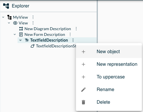
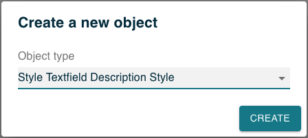
| A style is automatically created along the creation of a Widget Description. |
| The Flexbox Container Description, Image Description and Rich Text Description have no style. |
All static styles options are also directly applied and visible in the Form Description Editor.
Widgets Tools
Inside some Widget Descriptions you can also add operations to specify the interactive behavior of the widget. You can use any of the operations described below to program the behavior of the widget.
If you want to create new operations inside a Widget Description, just create ones by:
-
in the Widget Description's context menu (in the header), select New Object,
-
in the dialog box that opens, select any available operation in the drop-down list.

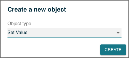
| The Flexbox Container Description, Bar Chart Description, Pie Chart Description and Image Description have no tools. |
4.3.3. Form description editor
To simplify and speed up the process of building a Form Description, a WYSIWYG editor is available. If you want to create new editor on a Form Description, just create one by:
-
in the Form Description's context menu (in the header), select New Representation,
-
in the dialog box that opens, select the FormDescriptionEditor item in the Representation type drop-down list.
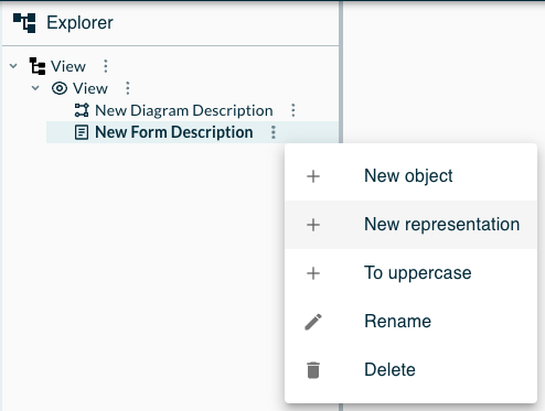
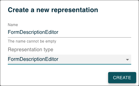
The Form Description Editor allows you to drag and drop groups and widgets from its left toolbar to its main area. You must create at least one Group to be able to drop widgets inside of it. Once dropped, the Widget Description will be created. You can move existing Widgets Descriptions inside the group or between groups by drag and dropping them. A drop zone (i.e. a red dotted rectangle) will appear when a Widget Description is dragged above another.
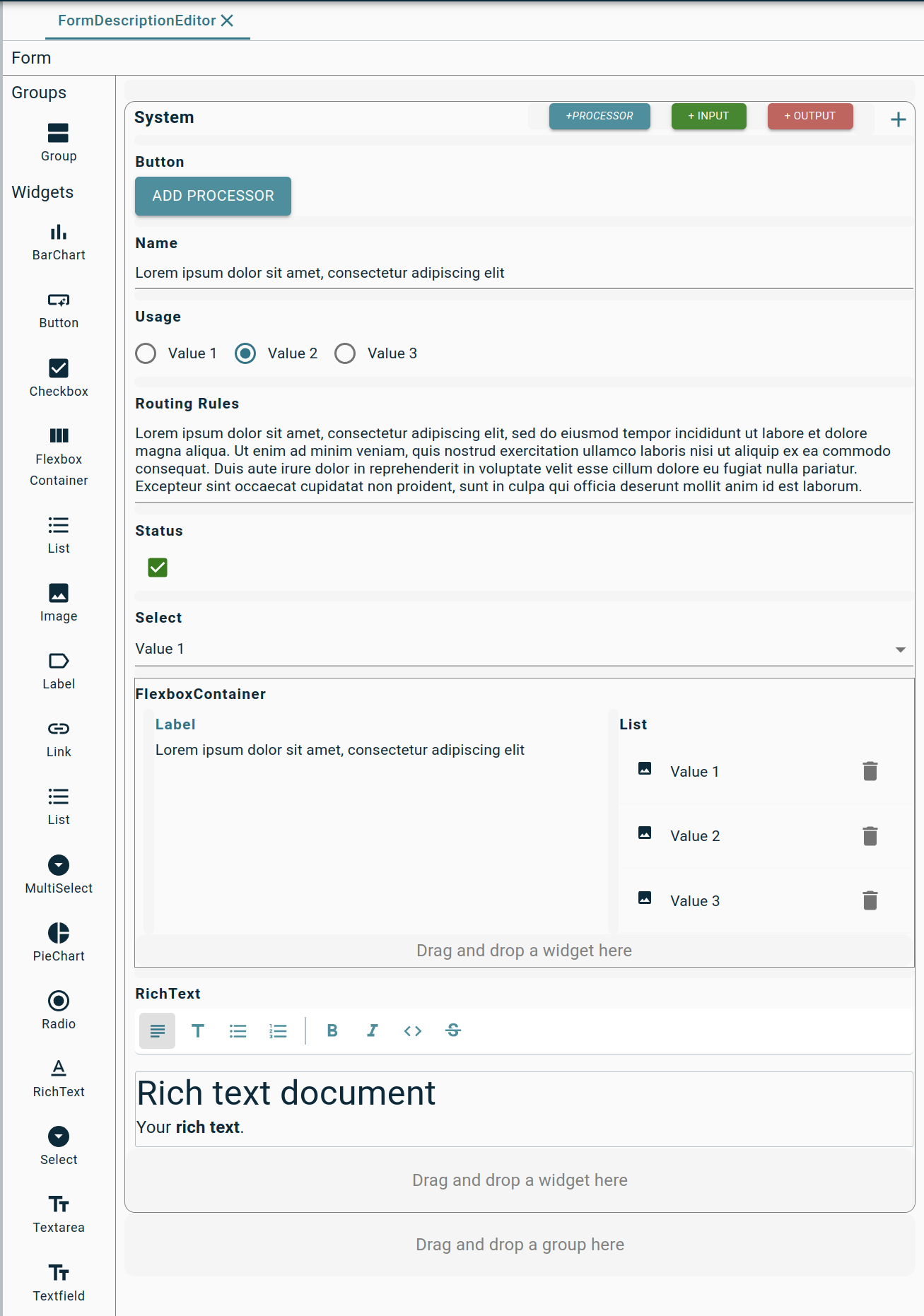
Where possible, the Form Description Editor shows the actual style of the widgets. This only applies to the statically-defined style properties of the default style. In the screenshots above for example, the three buttons in the top-right have non-default font size and colors defined in their default style, and these are visible directly in the Form Description Editor preview.
The Form Description Editor also allows you to create toolbar actions by clicking on the + icon in the top-right corner of a group.
You can move existing Toolbar Actions Descriptions inside the toolbar area area by drag and dropping them.
A drop zone (i.e. a red dotted rectangle) will appear when a Toolbar Action Description is dragged besides another.
Another drop zone will also appear at the end of the toolbar area.
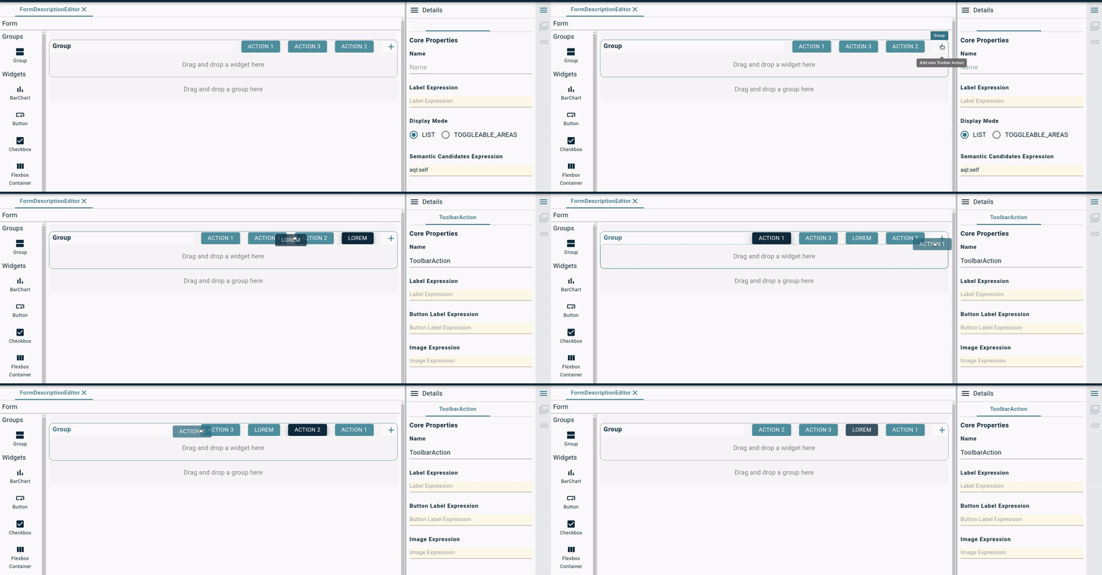
4.3.4. Tool Operations
The operations that are available to specify the behavior of tools are a subset of the model operations supported by Sirius Desktop:
-
Change Context: evaluates an expression (which can have side effects, e.g. by invoking a Java service), which should return a semantic element (it’s OK to return the original context). Then evaluates its children operation in the context of new element (which becomes the new
selffor these sub-operations). -
Create Instance: creates an instance of the specified type and attaches it as a child of the current element (
self) using the specified reference name (which should be a containment relation). The newly created instance is also bound to a new variable before executing its the sub-operations in the original context. -
Set Value: evaluates an expression, and set the current element’s (
self) named feature to the result. -
Unset Value: if no expression is supplied, unsets the named feature in the current element. If an expression is supplied, evaluates it and removes all the values in the result from the named feature of the current element.
-
Delete Element: removes the current element from the model. All references which pointed to it are deleted.
-
Create View: this is used to create a new graphical view on a diagram. This is only useful for nodes and edges which use the UNSYNCHRONIZED policy (see above), for which such view are not created automatically.
-
the Parent View Expression is evaluated to find in which parent container the new view should be created.
-
the Element Description indicates the type of node or edge which should be created.
-
the Semantic Element Expression should return the semantic element to be represented by the new view.
-
-
Delete View: this is used to delete a graphical view on a diagram, without deleting the underlying semantic element. This is only useful for nodes and edges which use the UNSYNCHRONIZED policy (see above), to manually implement the equivalent of the "Delete From Diagram" operation (for exemple to delete multiple views from a single tool invocation).
-
the View Expression is evaluated to find in which view should be deleted.
-
4.4. Current Limitations
The Web Studio Definition feature is still early in its development and has a number of limitations. It should be considered as an experimental feature to gather feedback, but should not be used with production data.
-
Whenever you change something in the definition of a domain, you must close and re-open any project which contain instances of that domain. Just reloading the browser’s page will not be enough for the instance project to pick up the new definition of your domain.
-
The model where you define your domain should contain nothing else, and in particular no instance of other dynamic domains.
-
If two domain definitions share the same name/identifier on a particular Obeo Studio server, the behavior is undefined. Only one of the domains will be visible at a time, but it is not guaranteed that it will always be the same, which can lead to bugs and data corruption.
-
Models instances created using a previous version of a domain definition may be partially or totally lost when reloaded if the domain definition is modified in an incompatible way.
-
It is possible to use custom Java services in the various interpreted expressions inside a View, but:
-
the corresponding Java classes must have been deployed on the backend when the server started, and registered using an
org.eclipse.sirius.web.emf.view.IJavaServiceProvider. -
because the domain definition is dynamic and not known when the server is started, any custom Java service must be written to work on a generic
EObjectand use EMF’s reflective APIs.
-
-
It is not currently possible to model the equivalent of EMF’s
eOppositerelations inside a Domain definition. The workaround is to useeContainerfor containment relations, andeInverse()for the others. -
It is not currently possible to model custom data types for domain attributes. The only types available for attributes are strings, booleans and numbers. The workaround for the moment is to use strings to serialize and parse other types (e.g. enums) if you need them.
5. Eclipse Platform Studio Definition
|
Before you Start
Who can use this feature Developers, Server administrators Included in Sirius Web |
5.1. Define your custom Domain using EMF metamodel
While the architecture of the Obeo Studio is not tied to the Eclipse Modeling Framework, EMF models are one of the supported type of domain models.
If you have an existing EMF metamodel which represents your business domain, to use it in you modeler you need to:
-
Make sure the VSMs (
odesignmmodels) you deploy in an Obeo Studio instance are valid and migrated to the exact version of Sirius Desktop used for the compatibility layer (currently Sirius Desktop 6.5.1). -
To be able to use complex AQL expressions and Java services,
odesignmodels must declare all the EMF metamodels they use on every representation that uses them. While Sirius Desktop supports multiple ways to reference such metamodels in anodesignmodel, for it to work in Obeo Studio you must reference them using theirnsURI, not relative paths orviewpoint:URLs. -
If your modeler is made of multiple representations (diagrams, properties, etc.) and/or multiple VSMs (
odesignfiles), make sure each individual representation description explicitly registers all the metamodels (via theirnsURI) and Java services classes it depends on. If you get error messages like[o.e.s.web.interpreter.AQLInterpreter : A warning has occurred with the expression 'aql:self.someService()': Couldn’t find the 'someService(EClassifier=SomeType)' servicein the backend logs this is probably the cause. -
Because Obeo Studio does not rely on the Eclipse Platform, make sure the Java service classes you reference in your VSMs do not depend on any Eclipse APIs beyond EMF Core. In particular they should not depend on any UI framework (SWT, JFace). If needed, split your service classes in two so that UI dependencies are isolated. The service classes which depend on the UI will fail to load in Obeo Studio, but the others will load and their services will be available.
-
Make sure the JARs for the metamodel itself and its
.editsupport are in your application’s classpath. Typically this involves publishing the two JARs in a Maven repository and adding their coordinates into your sample application’s POM file. Example in Sirius Web. -
Register your metamodel in your application. This is done by creating a Spring
@Configurationwhich provides your meta-model’sEPackageandAdapterFactoryas Spring@Beans. Example in Sirius Web. -
Provide an implementation of
org.eclipse.sirius.web.api.services.IImagePathServicewhich tells Obeo Studio in which folders (relative to the root of the JAR) the icons for your metamodel types can be found. Example in Sirius Web.
If you do not yet have an EMF-based domain model, you can use Ecore Tools to design and implement it, and then follow the same steps as above.
5.2. Define your custom Representations with Sirius Desktop
To use an existing odesign modeler definition in the Obeo Studio:
-
Make sure the JAR which contains the modeler definition is in your application’s classpath. Typically this involves publishing the
.designJAR in a Maven repository and adding its coordinates into your sample application’s POM file. Example in Sirius Web. -
In your application, provide a Spring
@Configurationwhich implementsorg.eclipse.sirius.web.compat.services.api.ISiriusConfigurationand tells the platform the path (inside the JAR) where the.odesignfile is available. Example in Sirius Web -
When your
odesignfile references your metamodels (which is needed for AQL expressions and Java services to work properly), make sure to use the "Add from registry" button in the VSM editor so that the reference can be resolved in the context of the Spring Boot application. If the metamodel is configured using "Add from workspace" or "Add from filesystem", it will get ignored in the Sirius Web context and some features will not work correctly.
5.2.1. Sirius Desktop Compatibility
Modelers based on the Obeo Studio can reuse Sirius Desktop modeler definition files (.odesign files).
Only a subset of the Sirius Desktop features are currently supported, but you can safely use a complete odesign file in the Obeo Studio.
The features which are not supported at the moment will simply be ignored. Future versions of the Obeo Studio will increase the scope of Sirius Desktop features supported. If you rely on specific features from Sirius Desktop, do not hesitate to contact us.
The Obeo Studio currently only supports a subset of Sirius diagrams and properties views. Tables, trees, and sequence diagrams are not supported at the moment.
For diagrams, the Obeo Studio currently supports the main features of:
-
nodes and containers, including list containers;
-
relation-based and element-based edges;
-
border nodes;
-
conditional styles;
-
creation tools, deletion tools, direct-edit tools, generic tools, edge reconnection tools.
For properties view, the following widgets are supported:
-
text fields and text areas;
-
checkboxes;
-
radio buttons;
-
select/combos;
-
lists (read-only).
Other differences and limitations include:
-
Obeo Studio does not (yet) support interpreted expressions which use the
service:prefix. If you use those, you can simply rewrite them into the equivalent AQL expression:service:someService(…)becomesaql:self.someService(…), andservice:someVariable.someService(…)becomesaql:someVariable.someService(…) -
The EMF Edit integration services which are available in Sirius Desktop using
input.emfEditServices(self)are not yet supported in Obeo Studio. -
Internationalization of labels defined in the VSM (notably for the tools) is not supported for the moment.
6. Custom Code Studio Definition
It is possible to contribute representations thanks to the Obeo Studio APIs. See the Sirius Web source code on Github: https://github.com/eclipse-sirius
Developer Guide
This sections describes the main APIs that are exposed by the Obeo Studio to build custom studios and extend the platform.
Every instance of the Obeo Studio is a custom Spring Boot application built by using reusable frontend and backend components provided by the Open Source Sirius Components project. When running on the entreprise version of the Obeo Studio, additional, proprietary components are available to provide more features, but the principles are the same.
The Sirius Components repository provides an example of a complete, ready-to-run studio based on the Open Source components in https://github.com/eclipse-sirius/sirius-components/tree/master/packages/sirius-web. It can be used as a starting point to create your own studio.
7. Project Webhooks
|
Before you Start
Who can use this feature Users with Owner access to the server can manage the webhooks Included in the Obeo Studio |
Learn the basics of how webhooks work to help you build and set up integrations.
Webhooks allow you to build or set up integrations which subscribe to certain events on the Obeo Studio. When one of those events is triggered, we’ll send a HTTP POST payload to the webhook’s configured URL. Webhooks can be used to update a database, update a backup mirror, integrate with another web appllication. You’re only limited by your imagination.
When a project event is triggered, the Obeo Studio provides a way to notify an external application. This mechanism is named webhook and works thanks to a REST API.
A webhook must expose an HTTP/HTTPS endpoint that implements the POST method to receive a body with a Webhook Notification.
The Obeo Studio provides several types of events to listen:
-
SEMANTIC: Triggered when a semantic object or a model is created, updated or deleted.
-
REPRESENTATION: Triggered when a representation is refreshed.
7.1. Register a Webhook
When you register a new webhook, the only thing to define is its URL.
To register a new webhook:
-
Open the Project Settings page.
-
Click the Webhooks section.
-
Set the URL.
-
Click on Add.
7.2. Unregister a Webhook
To unregister a webhook: . Open the Project Settings page. . Click the Webhooks section. . Click on the Remove button.
7.3. Webhook Notification
The webhook POST endpoint will receive notification messages. You can retrieve the json notification message in the POST body.
You can receive two types of notifications:
-
semantic change notification (identified by
"type": "EditingContextUpdated"), which send a snapshot of the current state of all documents/models inside the project whenever the semantic state changes; -
representation change notification (identified by
"type": "RepresentationUpdated"), which send a snapshot of the current state of a graphical representation (e.g. a diagram) whenever it changes.
A semantic notification example:
{
  "id": "278a3cdb-4a29-4857-8b07-14c486f9ce1e",
  "projectId": "2fcf5eab-d8cf-4661-9fcd-d34b7f1ed567",
  "type": "EditingContextUpdated",
  "content": {
    "documents": [
      {
        "id": "0c0e87bf-8595-4cc2-9d70-bedd8dfcec1b",
        "name": "Robot Flow",
        "content": "..."
      }
    ]
  },
  "date": 1639046521876
}
The content.documents.content fields are strings which contain the JSON serialization of the corresponding model.
A representation notification example:
{
  "id": "276c0000-3852-4e34-beee-bc6ef76e55df",
  "projectId": "2fcf5eab-d8cf-4661-9fcd-d34b7f1ed567",
  "type": "RepresentationUpdated",
  "content": {
    "representation": { ... },
  },
  "date": 1639046501314
  }
The content.representation field contains the direct JSON serialization of the corresponding representation.
Frequently Asked Question
How is Obeo Studio licensed?
If you are using Obeo Studio online (hosted by Obeo), this EULA applies.
Eclipse Sirius Web is licensed under the EPL 2.0 license, and you can find the source code at the Eclipse Foundation: https://eclipse.org/sirius.
What is Sirius Desktop vs Sirius Web vs Obeo Studio?
Eclipse Sirius is an open source project to create domain-specific modeling workbenches. It has two flavors:
-
Sirius Desktop: create modeling workbenches based on the Eclipse platform,
-
Sirius Web: create cloud-ready modeling workbenches.
The Obeo Studio is built as an open-core product relying on Sirius Web. It is a Sirius Web build extended with Enterprise features, to deploy on public, private clouds or on premise and including support and upgrade guarantees.
Authentication FAQ
How do I get an account to the Obeo Studio?
Navigate to the sign up page, fill the form and send your request. After a successful signup you should be able to use your new account directly.
How do I retrieve my Username / Password if I forgot them?
Ask to the administrator of the Obeo Studio server to send you back your credentials.
How do I change my Username?
Ask to the administrator of the Obeo Studio server to change the Username for you.
How do I reset my Password?
Ask to the administrator of the Obeo Studio server to generate a new password for you.
How do I delete my account?
Ask to the administrator of the Obeo Studio server to delete your account.
Export FAQ
Is it possible to upload an EMF model I created classicaly with Eclipse?
Yes definitely, if the metamodel corresponding to the model instance is deployed on the server. You can use the Upload a Model capability to import your data into the Obeo Studio.
How do I download a project?
See the Download a Project section to learn how to proceed.
How do I download a model?
See the Download a Model section to learn how to proceed.
How do I upload a project?
See the Download a Project section to learn how to proceed.
How do I upload a model?
See the Download a Model section to learn how to proceed.
Features
Features list
| Feature | Open Source (Sirius Web) | Enterprise (Obeo Studio) |
|---|---|---|
Projects Management |
||
|
|
|
|
|
|
|
|
|
|
|
|
|
|
|
Web-Based Studio Definition |
||
|
|
|
|
|
|
Collaboration |
||
(All the projects are Public) |
|
|
|
|
|
|
|
|
|
|
|
Representations |
||
Diagrams |
|
|
Forms |
|
|
D3-based representations |
|
|
Advanced |
||
|
|
|
|
|
|
Release Notes
Version 2023.1.0
Versions
Obeo Studio version 2023.1.0 corresponds to:
New and Improved
Core
-
#1386 Users can now upload their own images from a project’s new settings page (available in the project menu). These images can be displayed in forms using the new image widget, or in View-based diagrams using and ImageNodeStyleDescription and selecting the image in the list of available shapes.
Diagram
-
#1428 Add support for List layout compartment. We rely on the layout strategy engine handler switch and the layout engine handler switch to dispatch to the correct behavior depending on how children should be laid out and the type of the node. This kind of architecture has already been implemented for model operation for the View DSL. Nothing has changed if nodes have to be laid out freely.
-
#1467 Elk is now able to compute a list layout. It is an internal change, and thus, nothing should change for the end user
-
#1457 Make possible to provide an expression on the label edit tool in View DSL to initialize the direct edit label text field. We kept the current behavior for the compatibility layer but, in fine it will be possible to leverage the direct edit tool Input Label Expression to initialize the direct edit label text field.
-
#1453 Add new arrow styles Circle, FillCircle and CrossedCircle
-
#666 Make the contextual palette display the tools of the current selection
-
#1442 Selecting an element in a diagram can hide others
-
#1507 Missing variables during execution of a source reconnection tool from the View description (otherEnd,semanticOtherEnd,edgeView and editingContext)
-
#1462 Restore the missing hover / selected feedback on parametric SVG style
-
When clicking on a node in a diagram, the creation tools list is now always in the same order
-
#1485 Select the relevant edge reconnection tools
-
#1446 Add support for hidden and faded edges
Form
-
#1346 Add support for a Rich Text edition widget. The widget behaves in a similar way to the existing Textfield and Textarea widgets, except that the text value should be valid Markdown, and can be edited in a WYSIWYG way by the end user.
-
#1426 Add support for optional text completion on textfield widgets. This is enabled in the View DSL properties for domain types and AQL expressions
-
#1439 Add support for toolbar actions in Form/FormDescriptionEditor
-
#1437 Add support for styles preview in FormDescriptionEditor
-
#1494 Add width and height attributes to BarChart
-
#1510 Add support for multi-groups in Form/FormDescriptionEditor
-
#1364 Add support for a basic image widget
-
#1448 Create a default style for new TextArea widgets like for the others
-
#1431 The default implementation of the Property View should not try to handle a multi valuated EStructuralFeature of type String
Breaking changes
-
#1437 [backend]
sirius-components-formdescriptioneditorsnow depends onsirius-components-forms.IFormDescriptionEditorWidget.javahave been deleted,FormDescriptionEditor.javanow relies onAbstractWidget.javafromsirius-components-forms. -
#1437 [graphql]
formdescriptioneditor.graphqlsnow depends on widgets fromforms.graphqls
Dependency update
-
[backenđ] Upgrade to Apache Batik 1.16.0 (from 1.14.0)
-
[backend] Switch to Spring Boot 2.7.5
-
[backend] Switch to EMFJson 2.3.3
Known issues
You can find a list of the known issues (with workaround where relevant) being investigated by our engineering team on the following public bug trackers:
-
Sirius Components Issues, which concern the core components of the platform, shared by Sirius Web and Obeo Studio
-
Sirius Web Issue, which only impact the Sirius Web application.